Guide To Colour Brochure Printing In Singapore: Tips, Materials, And Techniques
Understanding Colour Brochure Printing
Colour brochure printing is a pivotal aspect of visual communication that blends artistic design with technical precision. It involves producing printed materials that utilize a full spectrum of colours to showcase a company's offerings, enhance branding efforts, and capture the attention of target audiences. Unlike monochrome printing, colour brochure printing employs advanced colour management techniques to reproduce vibrant, accurate, and consistent hues across every print run.
In the realm of marketing, colour brochures serve as a tactile extension of a brand's identity. They effectively convey complex information in an engaging manner, making them an ideal choice for introducing new products, highlighting services, or creating memorable corporate profiles. The visual appeal of a well-printed colour brochure can significantly influence consumer perception, fostering trust and encouraging engagement.
For businesses operating in Singapore, leveraging colour brochure printing can lead to numerous advantages. It allows companies to stand out in a competitive marketplace, appealing to potential clients with eye-catching designs and compelling visuals. Moreover, the tangible nature of printed brochures ensures a lasting impression, as recipients can repeatedly refer to printed materials, unlike digital counterparts which may be overlooked or forgotten.
Achieving optimal results in colour brochure printing requires a combination of strategic planning and technical expertise. The choice of design elements, colour schemes, paper quality, and printing technology all contribute to the overall effectiveness of the final product. When executed correctly, colour brochures become powerful marketing tools that communicate professionalism, creativity, and reliability — qualities that are highly valued in any industry.
Furthermore, the benefits of colour brochure printing extend beyond aesthetics. The process also emphasizes durability and quality, ensuring that printed materials withstand handling and maintain visual fidelity over time. This longevity helps reinforce branding messages and sustains marketing efforts without the need for frequent reprints.
In summary, colour brochure printing plays a crucial role in elevating a company's marketing strategy. It combines vibrant visuals with high-quality production techniques, ensuring that each brochure not only attracts attention but also reflects the company's commitment to excellence and innovation. Whether used for corporate presentations, trade shows, or direct mailing campaigns, colour brochures remain a compelling medium for engaging audiences and conveying key messages effectively in Singapore and beyond.
Understanding Colour Brochure Printing
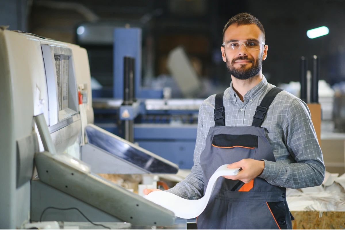
Colour brochure printing involves the production of vibrant, visually appealing printed materials designed to capture attention and communicate a message effectively. This process requires a strategic collaboration between graphic design and printing technology to ensure that the final product accurately reflects the intended colors, image quality, and branding objectives.
To produce high-quality colour brochures, selecting the right printing technology is essential. Modern digital and offset printing methods offer excellent colour fidelity, consistency, and detailed reproduction of images and text. Colour calibration plays a pivotal role in maintaining the accuracy of shades across multiple print runs, ensuring that each brochure maintains the same vibrant appearance.
The importance of colour accuracy cannot be overstated, especially in sectors such as fashion, food, and luxury goods, where visual appeal directly influences consumer perception. High-resolution printing, combined with precise colour management, ensures that every hue, tone, and shade is rendered meticulously, resulting in a professional and polished final product.
Materials and Finishing Techniques Influence Colour Outcomes
The choice of paper stock significantly impacts the vibrancy and durability of printed brochures. Glossy or satin finishes tend to enhance colour richness and brightness, making images pop and text appear sharp. Conversely, matte finishes offer a sophisticated look and reduce glare, which can be beneficial for readability in various lighting conditions.
In addition to paper selection, innovative finishing techniques such as varnishes, coatings, and embossing can amplify colour effects and add tactile appeal. These methods serve to accentuate design elements, protect the printed surface, and prolong the longevity of the brochure's visual impact.
Color Profiles and Proofing for Consistency
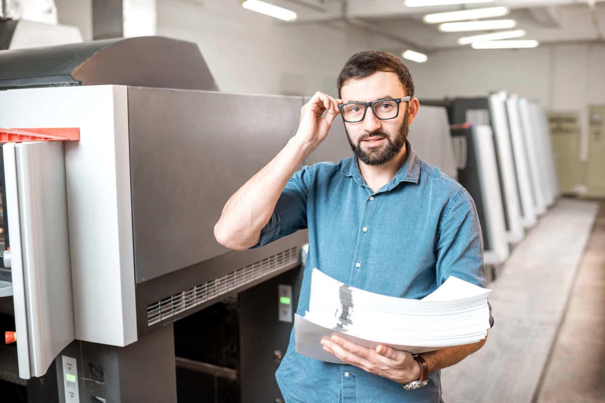
Implementing colour profiles in the pre-press phase ensures that digital files are prepared with the correct colour settings for printing. Soft proofs, which simulate the final output on a calibrated monitor, and hard proofs, which provide a physical sample, are critical steps for quality control. They allow designers and clients to verify colour accuracy, layout, and overall appearance before the final print run, minimizing waste and rework.
Considerations for Eco-Friendly and Cost-Effective Colour Printing
Environmental considerations are increasingly influencing colour brochure printing choices. Using vegetable-based inks and recycled paper options can reduce environmental impact while maintaining vibrant colour quality. Budget-conscious clients may opt for digital printing solutions that provide efficient short-run production with fast turnaround times, ideal for targeted marketing campaigns or limited editions.
Summary of Best Practices in Colour Brochure Printing
- Utilize high-resolution images and graphics to ensure clarity and vibrancy
- Select appropriate paper finishes to enhance colour effects
- Employ accurate colour management systems and profiles for consistency
- Incorporate proofing stages for quality assurance and alignment with expectations
- Explore eco-friendly inks and materials for sustainable printing options
By meticulously managing each step of the colour brochure printing process—from design and colour accuracy to material selection and finishing—businesses can achieve impactful marketing collateral that elevates brand perception and engages audiences effectively.
Methods for Ensuring Consistent Colour Accuracy in Brochure Printing
Achieving consistent and vibrant colours across multiple brochure batches requires rigorous colour management practices. Incorporating standardized colour profiles, such as ICC profiles, into the design and printing workflow is essential. These profiles help convert digital colours to printable colours accurately, maintaining colour fidelity regardless of the equipment or substrate used.
Calibration of monitors and printers is fundamental. Designers must work on colour-calibrated screens to ensure digital representations match the intended output. Similarly, printers should undergo regular calibration to minimize deviations that can occur over time or due to environmental factors.

Utilizing professional proofing methods, including soft proofs and hard proofs, allows for preemptive adjustments before the full print run. Soft proofs simulate the final output on calibrated monitors, enabling digital colour verification, while hard proofs serve as tangible samples for inspection of colour accuracy and material interactions.
Quality Assurance Measures During the Printing Process
Strict quality checks at every stage—from pre-press to the final print—are critical. During pre-press, designers should verify artwork for colour consistency, resolution, and appropriateness of colour profiles. During production, real-time monitoring of print runs ensures colour stability and consistency across the brochure batch.
Employing advanced printing technologies such as digital or offset printing with embedded colour management systems enhances uniformity. After printing, a review of selected samples against the approved proofs helps to identify and rectify any colour discrepancies early, thereby preventing costly reprints.
Advanced Technologies for Enhanced Colour Depth and Vibrancy
Modern printing solutions incorporate technologies like multi-layer colour inkjet or LED-UV printing, which enable a broader colour gamut and superior vibrancy. These methods can produce richer, more detailed colours with smoother gradations. Such technologies are especially useful for designs requiring complex colour blends, gradients, or metallic effects.
Additionally, special inks such as spot colours or metallic inks can be used to achieve specific branding effects that standard CMYK process inks cannot replicate. When integrated correctly, these techniques significantly enhance the visual impact of colour brochures, making them stand out.
Environmental and Cost-friendly Approaches to Colour Brochure Printing
Eco-conscious printing practices involve selecting sustainable materials and environmentally friendly inks. Vegetable-based inks, derived from plant oils, emit fewer VOCs and facilitate easier recycling of printed materials. Recycled paper options not only reduce environmental impact but also maintain vibrant colour output when used with quality inks and printing processes.
For clients mindful of budgets but still aiming for high-quality results, digital printing offers a cost-effective solution, particularly for short runs or personalized brochures. It requires less setup time and reduces waste, making it an efficient method without compromising colour quality.
Summary of Key Strategies for Superior Colour Brochure Printing
- Implement comprehensive colour management protocols using ICC profiles.
- Regularly calibrate all printing devices and monitors involved in the workflow.
- Employ proofing techniques—soft and hard proofs—to confirm colour accuracy prior to the main print run.
- Adopt advanced printing technologies capable of delivering wider colour gamuts and higher vibrancy.
- Consider eco-friendly inks and recycled substrates to align with sustainable initiatives.
- Utilize spot or metallic inks sparingly for special branding or design effects that require unique colour qualities.
- Conduct quality checks at each production stage to detect and address colour deviations promptly.
Meticulous attention to these aspects ensures that your colour brochures will possess the vibrancy and accuracy needed to effectively communicate your brand message. This thorough approach minimizes rework, optimizes costs, and results in marketing collateral that captures attention and supports your branding objectives.
Official Methods for Achieving Superior Colour Vibration in Brochure Printing
To ensure that colour brochures capture attention with vibrant, consistent hues, it is vital to employ established printing methodologies grounded in precision and quality control. One of the foundational steps involves meticulous color management protocols. This includes the use of standard ICC profiles which serve as a common language between digital files and physical prints, aiding in maintaining color fidelity throughout the workflow. Leveraging calibrated monitors during design work is imperative to accurately visualize color output before printing, preventing discrepancies that may diminish the vibrancy of the final product.
Before commencing the large-scale production, employing proofing techniques such as soft proofs on calibrated monitor screens and hard proofs on actual printing substrates allows for final color adjustments. This intermediate step minimizes the risk of color deviations in the main print run. Advanced printing technologies, such as wide-gamut digital presses with high-resolution capabilities, can reproduce a broader spectrum of colors, resulting in brighter, more saturated hues that effectively communicate the brand message.
Implementing Quality Assurance Measures for Colour Fidelity
Consistency is key in colour brochure printing. Regular calibration of printing equipment ensures that the colour output remains within specified tolerances across different production runs. Incorporating in-line spectrophotometers and colorimeters into the printing process allows real-time monitoring and immediate correction of color deviations. Additionally, establishing a comprehensive quality assurance protocol that involves checking at each stage—from prepress, through printing, to finishing—can catch irregularities early, preventing costly reprints and ensuring the final product aligns with the original design intent.
Best Practices for Colour Accuracy in Production
- Use of premium-quality inks that provide a wider color gamut and better coverage for vibrant, true-to-life colours.
- Selection of appropriate substrates—such as high-gloss or satin-finished papers—that enhance ink vibrancy and depth.
- Employing precise printing settings for ink density, pressure, and drying times tailored to the specific substrate and ink combination.
- Maintaining a dust-free and controlled environment within the printing facility to prevent contamination that could affect colour quality.
Furthermore, adopting spot and metallic inks strategically allows for accentuating particular design elements with shimmering effects and heightened colour depth, adding a distinctive touch to highly impactful brochures. These are applied selectively to preserve their visual impact without overwhelming the overall colour harmony.
Post-Printing Checks and Final Touches
Once the initial print run is complete, it is crucial to conduct thorough inspections matching the sample proofs. Color consistency across the entire batch ensures that each brochure reflects the true vibrancy intended in the design. Implementing finishing touches such as lamination or spot UV coating not only protects the print but can also amplify colour brightness and contrast, making the brochure more engaging and durable.
In sum, delivering high-impact, colour-rich brochures hinges on rigorous adherence to proven printing techniques, continuous quality controls, and choosing the right materials. These measures uphold the integrity of the original design, enable compelling visual communication, and bolster effective branding strategies.
Ensuring Colour Accuracy Through Legitimate Methods
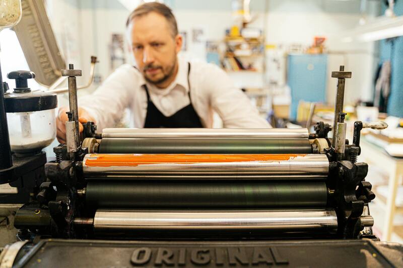
Achieving vibrant and consistent colour results in brochure printing relies on adherence to proven, official processes. Offset printing, renowned for its precision and high-quality output, requires meticulous calibration of colour plates and press settings. By using standardised colour profiles and maintaining precise alignment, printers can reliably reproduce the intended hues across large batches. Digital printing, on the other hand, offers flexibility and rapid turnaround, making it essential to use certified software that correctly interprets colour data. Proper calibration of digital presses and employing colour management systems ensures that the colours on-screen match the printed outcome, reducing discrepancies and enhancing brand consistency.
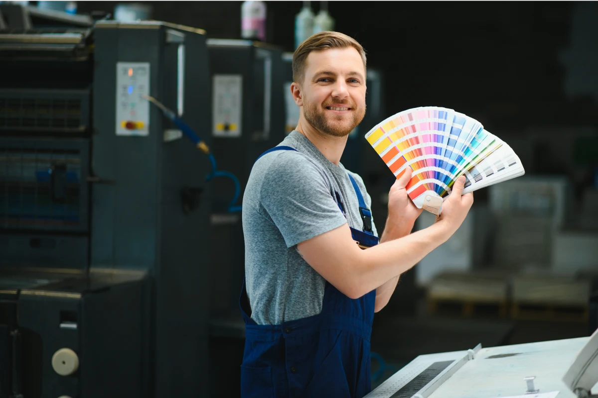
The choice of colour mode plays a critical role in colour fidelity. CMYK (Cyan, Magenta, Yellow, Black) remains the industry standard for full-colour brochure printing, as it aligns with subtractive colour mixing used in printing presses. Using high-quality colour profiles tailored for specific substrates guarantees that the colours are rendered accurately. Regular colour checks, including standardised colour charts and calibration tools, are implemented throughout the printing process to monitor and correct deviations, securing the vibrancy and sharpness of every brochure.
Steps to Maintain Consistent, True-to-Design Colours
- Artwork Preparation: Ensure that digital files are created using colour-accurate settings and appropriate profiles. Converting all images to CMYK before printing simplifies colour matching and reduces surprises.
- Proof Approvals: Obtain and review high-resolution proofs before commencing large-volume printing. This step verifies that colours match the designer’s intent under standard viewing conditions.
- Environment Control: Maintain a controlled environment within the printing facility to prevent dust, humidity, and temperature fluctuations from affecting colour consistency.
- Regular Calibration: Schedule routine calibration of printing equipment, including colour density and ink flow, to sustain accuracy over time.
- Use of Certified Materials: Select substrates and inks from reputable suppliers that comply with recognised standards, ensuring optimal ink adhesion and vibrancy.
For complex colour requirements or special effects, such as metallic or spot colours, employing officially sourced or custom-matched inks is essential. These methods are applied through well-established printing techniques that adhere strictly to industry standards. By following these official procedures, businesses can confidently produce colour brochures that are vibrant, precise, and true to the original design, thus reinforcing their branding and marketing efforts.
Material Options for Colour Brochure Printing
Choosing the right material is essential to maximise the vibrancy and durability of colour brochures. Materials vary in weight, finish, and resistance to environmental factors, each offering unique advantages for different marketing needs.
- Glossy Paper: This finish enhances colour brightness and contrast, making images pop and text appear sharp. Ideal for visually-driven brochures aiming to grab attention immediately.
- Matte Paper: Offers a sophisticated, non-reflective surface that reduces glare, perfect for brochures with detailed text or subtle colour palettes. Provides a professional and elegant appearance.
- Satin or Silk Finish: Strikes a balance between gloss and matte, delivering a smooth, soft sheen that accentuates colours while minimizing glare. A versatile choice for diverse brochure styles.
- Recycled and Eco-Friendly Materials: For brands committed to sustainability, various environmentally friendly papers are available, often with a slightly textured surface that holds colours well.
Application of Official and Established Methods
Ensuring the accuracy and vibrancy of colours in brochure printing relies on adherence to standard, proven processes. Experienced print providers employ a series of official steps to achieve consistent results that faithfully reproduce the original design.
- Colour Profiling and Calibration: Employing industry-standard colour profiles such as ISO-coordinated CMYK settings ensures that digital colours translate accurately onto physical prints.
- Use of Certified Inks and Substrates: Legitimacy is reinforced through the use of inks and papers sourced from reputable suppliers, which meet strict quality standards for colour consistency and adhesion.
- Proofing and Approvals: Prior to large-scale production, high-resolution proofs are reviewed to verify colour fidelity, allowing adjustments before final printing begins. This step is crucial for maintaining design integrity.
- Environmental and Equipment Controls: Maintaining stable environmental conditions within printing facilities, coupled with regular calibration of printing machinery, ensures colours remain consistent across batches.
- Application of Special Colours and Effects: When necessary, spot colours, metallic inks, or varnishes are integrated through controlled processes that conform with official standards, ensuring vibrancy and durability.
Adhering to these calibrated, verified methods guarantees that colour brochures not only exemplify design precision but also uphold brand consistency and visual impact. This meticulous approach confirms that printed materials genuinely reflect the quality and professionalism of the originating design.
Ensuring Accurate Colour Reproduction through Certified Technologies
To produce colour brochures that meet high standards of vibrancy and precision, leveraging advanced printing technologies is essential. Industry-standard printing equipment employs calibrated colour management systems, including ISO-coordinated CMYK profiles, which guarantee consistent colour output across different batches and print runs. Regular calibration and maintenance of printers ensure that the digital file colours consistently translate to the physical medium, preserving the integrity of your brand’s colour scheme.
Inks and substrates used in colour brochure printing play a vital role in colour fidelity. Reputable suppliers provide certified inks with proven adhesion and colour stability properties, safeguarding against fading, smudging, or colour variation. When selecting materials, premium-quality coated papers such as gloss or satin finishes are preferred for their enhanced colour vibrancy and smooth surface, which allows for sharper images and more vivid colours.
Implementing a Rigorous Proofing and Quality Control Process
The process begins with creating detailed digital proofs that emulate the final printed product. These proofs, often provided in high resolution, enable clients and designers to verify colour accuracy, layout consistency, and overall visual impact. Adjustments can then be made before proceeding to full-scale printing, minimizing costly reprints and delays.
Once approval is obtained, the production phase employs strict quality control measures, including environmental controls to maintain stable humidity and temperature, which influence ink drying and adherence. Periodic sampling during the print run ensures that each batch maintains the expected colour standards, with any discrepancies addressed promptly. This systematic approach ensures the finished brochures are vibrant, accurately coloured, and consistent throughout multiple copies or editions.
Integrating Special Colours and Finishing Effects Safely and Effectively
Beyond standard colour printing, techniques such as spot colours, metallic inks, and varnishes can be incorporated to enhance visual appeal and tactile experience. Spot colours require precise matching and are applied through controlled processes that adhere to stringent standards, ensuring the vibrancy and durability of special hues. Metallic inks, often used for accents or branding elements, are added through specialized processes that preserve colour integrity and glossiness.
Finishing options like UV coating or varnishing not only protect the printed brochure but also amplify colour vibrancy and gloss. Embossing, foil stamping, and creasing further add tactile and visual depth, making each piece stand out. These effects are applied using official techniques that conform with operational standards, guaranteeing consistent quality and a professional finish, which ultimately reflects positively on brand perception.
Conclusion
Reliably achieving high-quality colour brochures involves meticulous planning and adherence to proven methods. From selecting certified inks and calibrated equipment to implementing thorough proofing and quality assurance practices, every step contributes to delivering vibrant, accurate, and durable printed materials. Integrating special finishing techniques further elevates the visual and tactile impact, ensuring each brochure effectively communicates the intended message with professionalism and elegance.
Ensuring Quality and Authenticity in Colour Brochure Printing
When seeking to produce vibrant, high-quality colour brochures, it is essential to employ authentic methods that guarantee color accuracy, durability, and overall professional appearance. Certified printing processes utilize industry-standard techniques and equipment, ensuring that colors are reproduced consistently across different batches. This involves calibrated printers that adhere strictly to color profiles, providing consistent output that aligns with the original design intent.
In addition, official color matching systems, such as Pantone Matching System (PMS), are employed to ensure specific hues are accurately replicated. These systems enable designers and printers to communicate precise color specifications, reducing discrepancies that may occur during the production process. Furthermore, adherence to strict quality control protocols at each stage—from color proofing to the final print—helps prevent errors and ensures high fidelity in colour reproduction.
Choosing reputable printing providers who utilize certified inks and adhere to industry standards is crucial. Certified inks are formulated to offer long-lasting color vibrancy—withstanding exposure to light, moisture, and handling—without fading over time. These inks are also tested for their environmental safety and compatibility with different materials, ensuring a safe and sustainable printing process.
Quality assurance extends beyond the inks and equipment. It includes comprehensive proofing procedures where sample prints are reviewed to confirm color accuracy and overall quality before mass production. This step is vital to avoid costly reprints and to maintain the integrity of the final product.
Methods to Verify Authenticity and Quality
- Certified Inks and Supplies: Employing inks and materials approved by industry standards to guarantee vibrant, long-lasting colours.
- Color Management Systems: Utilizing advanced color profiling and calibration of printing equipment to ensure accurate color reproduction.
- Sample Proofing: Reviewing physical samples and digital proofs to validate colours and overall design before full-scale printing.
- Quality Control Checks: Implementing rigorous inspection protocols during and after printing to detect and rectify any discrepancies.
- Reputable Suppliers: Partnering with trusted providers known for strict adherence to industry standards and consistent quality outputs.
This comprehensive approach to authentic colour brochure printing ensures that the final product meets high standards of visual appeal, durability, and brand representation. Use of official techniques not only preserves the vibrancy of the colours but also reflects a commitment to excellence that enhances the credibility of your marketing materials.