Full Color Brochure Printing In Singapore: Quality And Customization
Overview of Full Color Brochure Printing
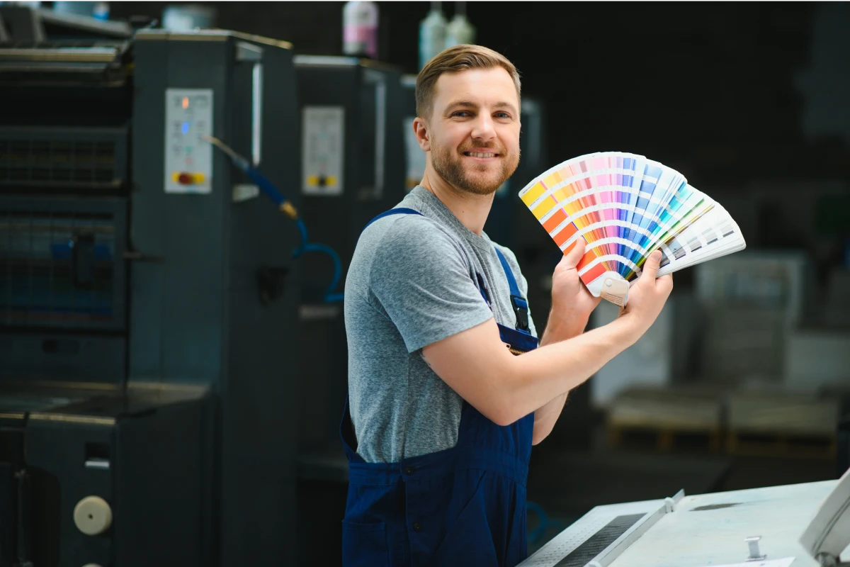
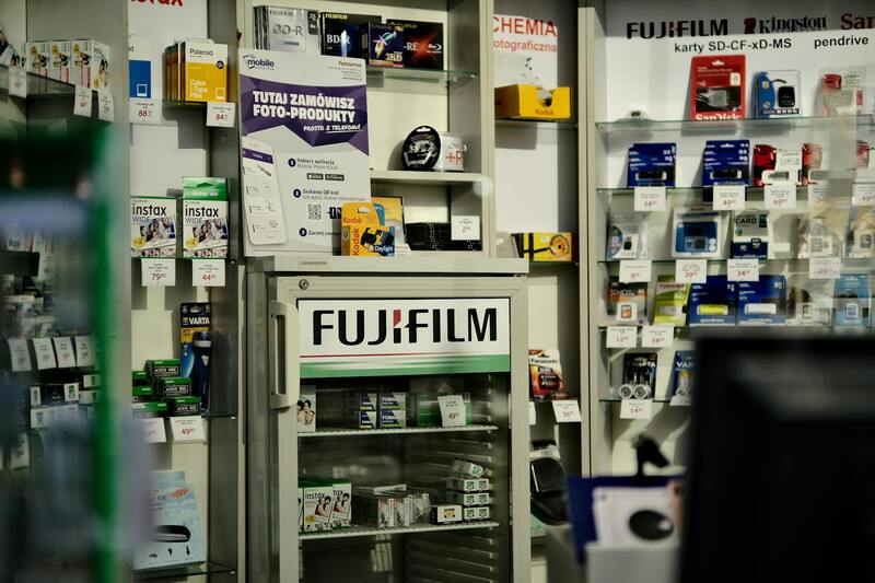
Full color brochure printing stands as a cornerstone in contemporary marketing strategies, enabling brands and businesses to communicate their messages with vividness, clarity, and professionalism. This method leverages advanced printing technology to produce brochures that incorporate a full spectrum of colors, turning simple marketing pieces into visually compelling tools that capture attention and convey complex information efficiently.
In Singapore’s competitive market, the significance of high-quality full color brochure printing cannot be overstated. It serves as a tangible extension of a brand’s identity, providing potential clients and customers with a glimpse into the company’s values, offerings, and professionalism. A meticulously printed brochure not only informs but also influences purchasing decisions by creating a memorable visual impression—key for businesses seeking to establish or reinforce their presence in diverse industries such as hospitality, real estate, retail, and corporate services.
Technologically, full color brochure printing involves using four-color process printing, typically known as CMYK (Cyan, Magenta, Yellow, and Key/Black). This method combines different ink layers to produce a seamless, rich, and accurate representation of colors, allowing for intricate designs and gradients that are essential for modern branding requirements. The outcome is a visually engaging marketing piece capable of catching the eye from a distance and maintaining clarity upon closer inspection.
Beyond aesthetics, the process is aligned with strategic marketing – allowing for detailed imagery, compelling graphics, and legible typography that work synergistically to deliver messages effectively. Whether for a glossy product catalog, event brochure, or corporate introduction material, full color brochure printing ensures that every detail reflects quality and professionalism, which are critical components in establishing trust and credibility within Singapore’s vibrant business environment.
Choosing to invest in full color brochure printing is also a strategic move towards versatile marketing. It can be customized into various styles and formats to suit differing campaign goals—from compact bi-folds and tri-folds to elaborate z-folds and accordion styles. This adaptability supports various thematic presentations, promotional offers, or brand storytelling efforts, making full color brochures an invaluable asset in any comprehensive marketing toolkit.
Production quality, color precision, and material selection directly influence the brochure’s overall impact. As Singapore continues to grow as a regional business hub, the demand for premium printed materials like full color brochures remains high. Businesses that partner with reputable printers—who utilize cutting-edge equipment and high-grade materials—can achieve a finished product that not only communicates effectively but also withstands the rigors of handling and time, thereby enhancing brand perception and customer engagement.
In summary, full color brochure printing offers a powerful combination of artistic excellence, practical versatility, and branding efficacy. It transforms everyday promotional materials into captivating visual narratives that leave lasting impressions on target audiences, making it an essential component for any business committed to excellence and growth in Singapore’s dynamic market landscape.
Endless Customization Options for Full Color Brochure Printing
One of the key advantages of choosing full color brochure printing with s7printing.com is the extensive range of customization options available, enabling brands to craft materials that precisely align with their visual identity and marketing goals. These options encompass a wide array of design, material, and finish choices, ensuring each brochure communicates a coherent and compelling brand message.
Color Calibration and High-Resolution Printing
Achieving vibrant and accurate color reproduction is crucial in full color brochure printing. Advanced printing technology ensures that the colors you see on your screen are rendered faithfully onto high-quality paper stock. This process utilizes precise color calibration techniques, producing brochures with rich hues and nuanced shading that capture attention and evoke the intended emotional response.
Variety of Material and Finish Choices
Material selection plays a vital role in the tangible impact of your brochures. Options range from matte, gloss, or satin finishes to premium cardstock or textured papers, each adding a distinct tactile element. The choice of material influences durability, look, and feel, allowing brands to select a finish that complements their aesthetic and functional needs.
- Standard Coated Paper: Provides a smooth, glossy surface ideal for vibrant images.
- Matte Finish: Offers a subdued, elegant appearance with less glare, suitable for sophisticated branding.
- Textured Papers: Adds tactile depth, enhancing perceived quality and uniqueness.
Specialized Finishes and Embellishments
For brands seeking to elevate their brochures beyond standard printing, additional finishing touches are available. Techniques such as embossing, debossing, spot UV coating, foil stamping, and die-cutting can accentuate specific design elements, create tactile contrast, and make each piece more memorable.
Design Flexibility and Binding Styles
Full color brochure printing accommodates various formats and binding styles. Whether opting for traditional saddle-stitching, perfect binding, or more elaborate options like spiral or wire binding, each choice offers different levels of durability and presentation style. The format can be adapted into bi-fold, tri-fold, Z-fold, or elaborate multi-page layouts, providing flexibility to suit any content complexity or visual storytelling approach.
Impact of Customization on Marketing Performance
Custom-tailored printing options significantly enhance the effectiveness of printed materials. A well-designed brochure with vibrant colors, premium materials, and unique finishes not only attracts attention but also fosters a sense of professionalism and trustworthiness. This tangible quality helps reinforce your brand message, making a lasting impression on potential clients or partners.
Ensuring Consistency with Brand Guidelines
Advanced full color printing methods allow for precise adherence to brand color palettes and visual standards. This consistency across your marketing collateral ensures that your brand’s identity remains uniform and recognizable, which is essential in building brand awareness and customer trust.
Conclusion
When selecting full color brochure printing, leveraging the array of customization options offered by trusted printers like s7printing.com ensures a product that is not only visually compelling but also strategically aligned with your business objectives. The ability to tailor materials, finishes, and formats gives your brand the edge in a competitive marketplace by delivering memorable, professional-quality print communications.
Materials and Paper Choices
Optimizing the tactile and visual appeal of full color brochures begins with selecting the right paper stock and finishing options. High-quality paper enhances durability and provides a luxurious feel that aligns with premium branding. Common choices include coated papers such as gloss, matte, and semi-gloss, each offering distinct advantages for different design aesthetics and purposes.
Gloss finishes amplify color vibrancy and sharpness, making images and text pop with brilliance—ideal for product catalogs or marketing materials that demand eye-catching visuals. Matte finishes, on the other hand, provide a sophisticated, non-reflective surface that reduces glare, adding an elegant touch suitable for professional presentations and portfolios. Semi-gloss offers a balanced finish, combining the vibrancy of gloss with the subdued elegance of matte.

Textured papers further elevate the sensory experience, imparting a unique character that can differentiate your brand. Some options include linen, felt, or canvas textures, which lend an artisanal feel to your materials and reinforce a perception of quality and craftsmanship. Choosing the appropriate paper weight—from lightweight 80gsm to heavyweight 170gsm or more—also impacts durability and perceived value.
Color Printing Techniques and Vibrancy
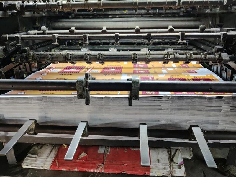
Achieving striking vibrancy and consistency in full color brochure printing relies on advanced color management and printing techniques. Digital and offset printing methods both support rich, accurate color reproduction, but offset printing generally offers higher precision and uniformity for large quantities.
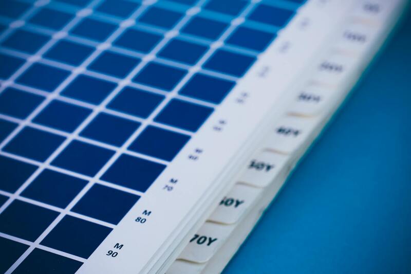
Utilizing the Pantone color system can ensure brand colors are rendered faithfully across different print runs. Incorporating color calibration and proofing during the pre-print stage helps prevent unexpected discrepancies and guarantees that hues are exactly aligned with your branding standards.
High-quality inks and precise halftone technologies allow for deep blacks, bright whites, and vibrant hues that stand out even on textured or matte papers. For visuals that require a high degree of detail and depth, UV coating or aqueous coatings can be applied post-print to enhance glossiness, protection, and color richness.
Overview of Full Color Brochure Printing
Full color brochure printing stands as a cornerstone of effective marketing and brand communication, offering vivid visuals and comprehensive information in a compact, professionally finished format. This method ensures that every brochure not only captures the essence of your brand through vibrant imagery and crisp text but also reinforces your message with high-quality finishes that resonate with your target audience. The process involves precise color management and high-resolution printing techniques that deliver consistency across varied print runs, making it a reliable choice for businesses aiming to make a memorable impression.

Choosing the right approach for full color brochure printing involves understanding your specific needs, target demographic, and distribution channels. These printed materials serve diverse purposes—from showcasing products and outlining services to delivering corporate messages and launching marketing campaigns. The capacity to produce high-quality, visually appealing brochures in large quantities ensures your brand maintains consistency and professionalism in every piece distributed.
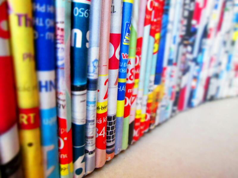
Types and Styles of Brochures
Brochure formats vary widely to suit different marketing objectives and design preferences. Common styles include bi-fold, tri-fold, z-fold, gate fold, and accordion fold, each offering unique ways to organize content and engage readers. For instance, tri-fold brochures provide multiple panels for segmented information, ideal for highlighting various product categories or services. Gate folds open to reveal expansive visuals or detailed descriptions, making them perfect for luxury brands or high-impact presentations. Print service providers in Singapore often customize these formats to align precisely with your branding strategy.
Designing these formats requires an understanding of how viewers interact with printed materials, ensuring that the flow of information guides the reader naturally from cover to inside pages. A professional printer can assist with layout optimization, ensuring that vital messages and visuals are emphasized appropriately while maintaining a cohesive aesthetic across the entire piece.
Materials and Paper Choices
The selection of materials significantly influences the tactile experience and perceived value of your brochures. Options range from standard gloss and matte coatings to textured finishes like linen, felt, or canvas, which lend an artisanal feel that can elevate your brand's image. The choice of paper weight is equally crucial; lightweight options around 80gsm are suitable for handouts or direct mail, whereas heavier papers, upwards of 170gsm, provide robustness and a luxurious feel. High-quality paper enhances color vibrancy and durability, essential for brochures intended for repeated handling or outdoor distribution.
In addition to durability, consider the environmental impact of your choices. Many printing providers offer eco-friendly paper options, including recycled stocks and FSC-certified materials, aligning your marketing efforts with sustainability goals. The combination of premium paper and vivid inks ensures that the final product commands attention while remaining resilient to wear and environmental factors.
For businesses seeking to make a sophisticated impression, combining textured papers with advanced printing techniques—such as spot UV coating or aqueous coatings—can dramatically enhance the visual appeal and tactile quality of the brochure. These details reflect a commitment to quality that can positively influence how your brand is perceived in competitive markets.
Methods and Techniques for Achieving Accurate Color in Full Color Brochure Printing
Ensuring precise color reproduction in full color brochure printing is essential for capturing your brand’s essence and making a memorable visual impact. Several official methods and standardized practices are employed in the industry to guarantee that printed colors align closely with digital designs and meet client expectations. These methods not only enhance the vibrancy and fidelity of printed materials but also maintain consistency across large production runs, reinforcing brand integrity.
Color Management Systems (CMS)
Color Management Systems form the backbone of accurate color reproduction in professional printing. By utilizing ICC profiles—standardized color references—these systems calibrate the entire workflow, from digital design software to the printing press. An ICC profile encapsulates the color characteristics of specific devices and media, ensuring that colors look consistent regardless of the medium. Proper calibration of monitors, proofing devices, and printers, guided by the CMS, minimizes discrepancies and provides a predictable outcome.

Use of Standardized Color Spaces
Color spaces such as CMYK and Pantone serve as standardized frameworks that guide color reproduction in print media. CMYK is the primary color model used in full color printing, combining cyan, magenta, yellow, and black inks. Proper conversion of digital designs from RGB (used in screens) to CMYK ensures that colors are represented accurately for printing. When specific brand colors are required, Pantone Matching System (PMS) ensures reproducibility across different print runs, offering a standardized palette that translates into consistent hues in the final product.
Proofing and Color Verification
Before proceeding to full-scale printing, utilizing accurate proofing methods is critical. Digital proofs provide an initial preview, but physical proofs—either printed on the actual stock or through high-fidelity printing simulations—are essential for verifying color accuracy. Extended color proofing technologies, such as contract proofs or digital color proofing devices, allow stakeholders to review and approve colors under standardized viewing conditions. This step mitigates mismatched expectations and ensures that the final brochure aligns with the intended design intent.
Advanced Printing Techniques for Color Fidelity
Several industry-standard techniques are employed to elevate the vibrancy and precision of full color brochures:
- Offset Printing: Offers high-quality color reproduction with finely controlled ink application, ideal for large-volume runs where color accuracy is paramount.
- Digital Printing: Suitable for short runs with quick turnaround times, using advanced toner or inkjet technologies that can replicate complex color gradients effectively.
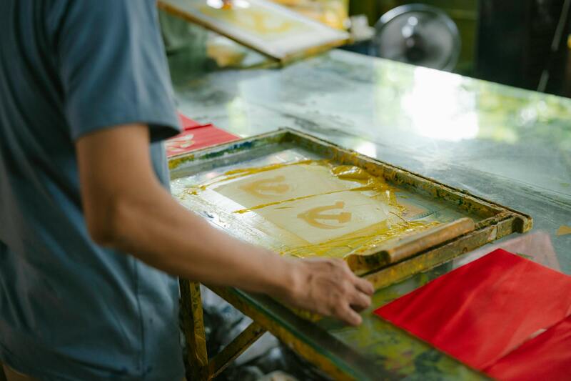
- Screen Printing: While less common for brochures, it can be utilized for specific effects requiring high opacity or vibrant solid colors.
- Spot Color Printing: Combines process colors with dedicated Pantone inks to achieve precise hues, especially useful for brand colors that demand consistency.
Specialized Finishing Techniques to Enhance Color Impact
Beyond the printing process, finishing techniques can significantly influence how colors are perceived. Coatings like aqueous or varnish layers add gloss and depth, making colors pop and providing additional protection against environmental factors. Spot UV coatings, applied selectively, can highlight specific areas with a high-gloss shine that contrasts with matte backgrounds, amplifying color vibrancy. Textured finishes such as linen or felt can also modify light reflection, enhancing tactile engagement and visual richness.
Conclusion
Implementing official, industry-standard methods for color management in full color brochure printing—ranging from meticulous calibration, strategic color space conversions, rigorous proofing, to advanced printing and finishing techniques—ensures that your brochures deliver vibrant, consistent, and accurate colors at every copy. These practices are essential for representing your brand authentically, capturing attention effectively, and achieving the professional appearance your marketing campaigns demand.
Understanding the Methods for Achieving Accurate and Vibrant Colors in Full Color Brochure Printing
High-quality full color brochure printing hinges on precise color management practices that guarantee your marketing materials showcase your brand with clarity and vibrancy. Implementation of official, industry-recognized techniques ensures consistent color output across all copies and substrates, fostering brand integrity and audience engagement. The core methods involved include meticulous color calibration, strategic color space conversions, rigorous proofing processes, and advanced printing and finishing technologies.
Color Calibration and Profile Management
Effective color management begins with the calibration of printing equipment. Printer calibration involves adjusting equipment settings to align with standardized color profiles, which serve as benchmarks for color reproduction accuracy. Before production, printers are calibrated using spectrophotometers to measure and correct discrepancies in ink density, color accuracy, and tonal range. Utilizing ICC (International Color Consortium) profiles tailored to specific paper types and ink combinations ensures that colors are reproduced faithfully throughout the printing process. This standardization helps mitigate variations caused by hardware differences or environmental factors, resulting in a uniform, predictable color response.
Color Space Conversion and Gamut Management
Converting design files from digital color spaces, such as RGB, to the CMYK color space used in printing is a critical step in maintaining color fidelity. This conversion must be handled using color management software that accurately maps colors within the printer's gamut—the range of colors that can be produced. Employing color gamut warning tools allows designers to identify and adjust colors outside the printable range, preventing undesirable color shifts or dulling. For brand-critical colors, dedicated Pantone Spot Colors are often used in conjunction with process printing, ensuring exact hue matching regardless of variations in printing conditions.
Proofing and Quality Verification
Before proceeding to large-scale production, high-fidelity proofing is essential. This may include digital proofs, which simulate the final output on calibrated monitors, and physical proofs, which are printed samples that verify color matches on the chosen paper stock. Using standardized proofing techniques ensures that clients can review and approve color accuracy before committing to full production, avoiding costly reprints and ensuring the final product meets expectations. Regular proofing checkpoints throughout the print run allow for real-time adjustments, ensuring continued consistency.
Advanced Printing Techniques for Color Fidelity
Modern printing presses employ sophisticated technologies like four-color (CMYK) presses with inline color management systems that automate color matching during production. Some printers incorporate extended gamut inks and additional color channels, such as orange, violet, or red, to expand the printable color range. These innovations facilitate the reproduction of more vibrant, nuanced hues, making your brochures stand out visually.
Finishing Techniques to Amplify Color Impact
Post-press finishes can drastically influence color perception. Applying coatings such as aqueous gloss or varnish overlays enhances the depth and luminance of colors, giving your brochures a polished appearance. Spot UV coatings applied selectively to specific areas create contrast and draw attention, elevating the sense of vibrancy and sophistication. Textured finishes like linen or felt increase tactile engagement and modify light reflection, enriching the overall visual richness of printed materials. These finishing choices are instrumental in delivering a memorable unboxing experience and ensuring your brochure’s colors stay vivid over time.
Implementing Industry Standards for Consistent Results
Adherence to recognized industry standards, such as ISO 12647, ensures structured color workflows and reproducibility. These standards define process control guidelines for pre-press, printing, and finishing stages, enabling consistent color output regardless of the production environment. Regular audits and calibration exercises aligned with these standards safeguard that the high standards are maintained throughout the printing lifecycle.
By systematically integrating these proven methodologies—precise calibration, careful color space management, thorough proofing, and advanced finishing techniques—your full color brochures will reliably reproduce vivid, accurate hues that align with your brand identity. Ensuring color fidelity is not merely a technical process but a strategic approach that bolsters brand perception, enhances visual appeal, and maximizes the impact of your marketing efforts.
Implementing Industry Standards for Consistent Results
To ensure that the vibrancy and accuracy of your full color brochures are maintained across all prints, adherence to established industry standards is crucial. Standards such as ISO 12647 define the guidelines for color management workflows, enabling precise control over color reproduction during pre-press, printing, and finishing processes. These guidelines specify the timing and calibration procedures necessary for consistent results, regardless of the batch or printing environment. By following these standards, print providers can minimize color discrepancies, ensuring that each brochure reflects your brand's intended palette with fidelity.
Regular calibration of printing equipment is integral to maintaining color consistency. This involves using standardized color targets and spectrophotometers to verify that printers reproduce colors accurately according to predefined color spaces. Additionally, employing standardized color profiles during file preparation ensures that the digital files match the printed output. This process is vital for achieving colors that are both visually appealing and true to your brand identity, especially when multiple print runs are involved. Consistent color calibration, coupled with rigorous proofing and approval stages, guarantees that your full color brochures meet high quality standards every time.
Color Calibration and Industry Standards for Vibrant, Accurate Prints
Color calibration goes beyond equipment adjustments; it encompasses the entire workflow, from digital file preparation to final printing. Implementing advanced color management practices such as ICC profiling aligns the color output of different devices, ensuring consistency across various stages of production. Proofing techniques, including digital and hard proofing, allow for verification of color accuracy before mass printing. These measures help prevent costly reprints and revisions, while also solidifying the expectation for high-quality, vibrant brochures.
Furthermore, industry standards advocate for maintaining proper lighting conditions and viewing environments during proofing and evaluation processes. This helps assess the vibrancy and accuracy of the colors under conditions similar to how they will be perceived by your audience. Consistency in these steps guarantees that each print not only matches your digital design but also stands out with lively, true-to-color visuals that resonate with viewers and reinforce your brand message.
Understanding the Essence of Full Color Brochure Printing
Full color brochure printing embodies the pinnacle of visual communication, offering dynamic, vibrant, and engaging marketing materials that capture attention and convey messages effectively. At its core, this printing process uses four-color process printing technology, permitting the reproduction of complex images, gradients, and subtle color variations. The result is a brochure that not only presents information but does so with a compelling aesthetic that aligns with and enhances your brand identity.
Advancements and Industry Standards in Color Fidelity
Modern full color brochure printing leverages sophisticated color management protocols — including ICC profiling and calibration techniques — to ensure color consistency across different print runs. These procedures help match digital designs precisely to printed output, which is critical when maintaining brand integrity. Rigorous proofing stages, involving both digital proofs and physical samples, serve as checkpoints to verify color accuracy before bulk production. Adhering to industry-standard lighting and viewing conditions during evaluation ensures the vibrancy and tonal richness of the printed pieces meet high-quality expectations, making every brochure a true reflection of the original design.

Selective Material and Paper Choices for Optimal Results
The material selection plays a vital role in the final appearance and durability of full color brochures. Premium coated papers, such as gloss or semi-gloss finishes, enhance the vibrancy of images and help colors pop for visual impact. Uncoated textures, on the other hand, provide a tactile experience, often used in more subdued or sophisticated branding. Weight, finish, and coating options should be matched to the intended purpose and distribution method of the brochure — whether it’s for high-end product showcases, event handouts, or comprehensive catalogs. Choosing the right paper ensures longevity and a premium professional feel that aligns with your brand standards.
Color Printing Techniques That Amplify Visual Impact
Advanced printing techniques in full color brochure production include four-color process printing, spot color enhancements, and specialty finishes such as matte, gloss, or UV coatings. Four-color process printing allows for the seamless reproduction of photographs and complex visuals, blending cyan, magenta, yellow, and black inks to produce a spectrum of colors. Spot colors can be employed for brand-specific hues that demand precision beyond CMYK reproduction. Applying specialty finishes, like UV coatings over images or text, adds a tactile layer of sophistication, highlighting key messages or visuals and making the brochure stand out.
Eco-Friendly and Sustainable Practices
More manufacturers now integrate eco-conscious processes by using recycled materials, vegetable-based inks, and environmentally friendly coatings. These practices demonstrate corporate responsibility, appeal to eco-aware audiences, and comply with sustainable standards in printing. Ensuring that your full color brochures are produced via environmentally responsible methods not only enhances brand reputation but also aligns with global efforts toward sustainability.
Customization Options for Unique Brand Expression
From custom sizes and fold styles to unique finishes and textured papers, customization allows your brochures to echo your brand's personality vividly. Die-cut shapes, embossed elements, and specialty folds such as z-folds or accordion folds introduce tactile interactivity, making your marketing piece memorable. Moreover, integrating foil stamping for accents or metallic inks can elevate the perceived value of the brochure, setting it apart from standard printed materials. Tailoring these options ensures your brochures serve their purpose in a way that resonates with your target audience and reflects your brand’s distinctive voice.
Design and Content Strategies for Maximum Impact
Effective design harmonizes visuals and content, emphasizing key messages through strategic use of colors, imagery, and typography. Consistency in visual language enhances brand recognition, while clear, concise content guides readers naturally through the brochure’s narrative. Incorporating high-resolution images that showcase your products or services boosts visual appeal, complemented by compelling headlines and calls-to-action (CTAs). Developing an intuitive layout that balances imagery and text ensures the brochure is engaging without overwhelming the reader, thus improving their overall experience and response rate.
Scheduling, Cost, and Benefits of Bulk Production
Efficiency in full color brochure printing is achieved through strategic planning and bulk ordering. Larger print runs typically lower overall costs due to economies of scale, making bulk production economically advantageous for annual campaigns or large-scale distributions. Precise scheduling and quick turnaround options allow businesses to meet tight deadlines without compromising quality. Additionally, repeat orders benefit from consistent color matching and quality control processes established during initial print runs, preserving brand continuity across campaigns. Advance planning ensures timely deployment for promotional events, product launches, or seasonal marketing pushes, maximizing ROI.